Your Shopify collection page shows one card per product. A jacket in six colourways is a single tile with a single image and a single price. Five of those colourways are invisible until somebody clicks.
This guide shows how to show variants on collection pages as separate cards — variants as products — on any Shopify theme, without editing theme code or duplicating a single product. The setup is identical on Dawn, on Horizon, on Impulse, on Debut, and on every theme in between, so this one article covers all of them.
What “show variants on collection” means
Every Shopify theme builds its collection grid from the same Liquid loop: it iterates collection.products and renders a card for each product. Variants live one level below that, so they never get their own grid slot.
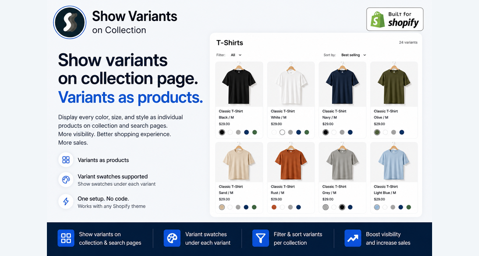
Splitting variants flips it. Each variant becomes its own card, with its own image, its own price, its own link and its own place in the sort order. The jacket becomes six tiles — Black, Bone, Rust, Olive, Sand, Navy — sitting side by side.
Merchants search for this a dozen different ways: show variants on collection, variants as products, split variants, show variants as separate products, variants on collection page. They all describe the same change.
It matters most when:
- Colour is the product. Apparel, footwear, cosmetics, paint, yarn, phone cases. Shoppers scan a grid for a colour; a card showing the wrong colour is a card they scroll past.
- Size or weight drives price. Candles, coffee, supplements, packaging, print sizes. A “$49” card hides the $9 entry point.
- You rely on filters. Filter to “Olive” on a normal grid and you get every product that happens to come in olive — most cards still showing something else.
- You run paid traffic to collections. Every colourway that never appears in the grid is inventory you paid to hide.
Three ways to do it (two of them cost you)
1. Duplicate the products
Turn one product into six real products. It works, and it is the most expensive option available:
- Inventory splits across six records instead of one product with six variant stock levels — every feed, sync and 3PL integration has to agree
- Reviews split. 60 reviews on one product becomes ten each. Your best page loses its social proof.
- Analytics split. Product reporting now tells you how six products are doing, not how the jacket is doing.
- SEO cannibalisation — six near-identical pages competing for the same query
- Maintenance multiplies. Every price change, description edit and photo, six times over, forever.
- The product page gets worse. Shoppers lose the variant picker; switching colour becomes a page load instead of a click.
You permanently damage the catalogue to fix a display problem on one page.
2. Edit the theme
A developer rewrites the collection grid to loop variants. Cheaper and reversible, but:
- It has to be repeated for search results, homepage featured collections, related products and every other grid
- Pagination still counts products while the grid renders variants, so page sizes drift
- Every theme update is either skipped or re-patched at your cost
- On the newest themes the product card is a nested block tree, not one snippet, which makes the patch considerably harder
- Hide rules, title formats, per-collection exceptions and swatches all become custom code you now own
3. Split at display time
Leave the catalogue exactly as it is — one product, its variants, one product page, one set of reviews, one inventory record — and change only what the grid renders.
That is what Stamp — Show Variants on Collection does. It attaches through Shopify’s app embed system, so no theme file is edited and no product data is rewritten. Turn it off and the grid goes back to normal instantly.
| Duplicate products | Edit theme | Split at display time | |
|---|---|---|---|
| Catalogue stays intact | No | Yes | Yes |
| Inventory stays intact | No | Yes | Yes |
| Reviews stay together | No | Yes | Yes |
| Survives theme updates | Yes | No | Yes |
| Covers search & homepage too | Yes | Extra work each | Yes |
| Reversible in one click | No | No | Yes |
| Setup time | Days | Days | Minutes |
The setup — identical on every Shopify theme
This is the part people expect to be theme-specific. It is not. Because the app runs as an app embed rather than a theme edit, the same six steps apply whether you are on Dawn, Horizon, Impulse or a vintage Debut.
Step 1 — Enable the setting
Two independent switches on the dashboard:
- Show variants separately — splits variants into their own cards. This is the one you want.
- Show product price range — keeps one card per product but replaces the single price with a range or a “From” price.
Step 2 — Select a collection
Pick the collections the app runs on. Start with one colour-heavy collection so you can judge the result fast. The free plan runs on a limited number; paid plans unlock all collections, including an All collections switch.
Step 3 — Select a theme
By default the app affects your published theme. On a live store, duplicate your theme first and select the unpublished copy in Theme settings — everything previews on the copy until you publish.
Step 4 — Choose what to split by
The single decision that shapes the whole grid.
| Setting | What appears in the grid | Typical use |
|---|---|---|
| Show 1st option separately | One card per value of the first option (e.g. Color) | Apparel, cosmetics |
| Show 2nd option separately | One card per value of the second option (e.g. Size) | Candles, coffee, packaging |
| Show 1st and 2nd combined | One card per pair (e.g. Blue / 45) | Footwear where both matter |
| Show all options combined | One card per variant | Small catalogues, made-to-order |
| Show selected options separately | One card per value of the option names you type in | Mixed catalogues with inconsistent option order |
The most common mistake is picking “1st option” when option order is not consistent across your catalogue. If half your products are Color/Size and the other half are Size/Color, use Show selected options separately and type the option names in explicitly — including every language version your store uses: Color, Colour, Couleur, Farbe, Renk.
The second most common mistake is reaching for “all options combined”. A product with 5 colours × 6 sizes becomes 30 cards. Split on the axis your shoppers actually browse and let the product page handle the rest.

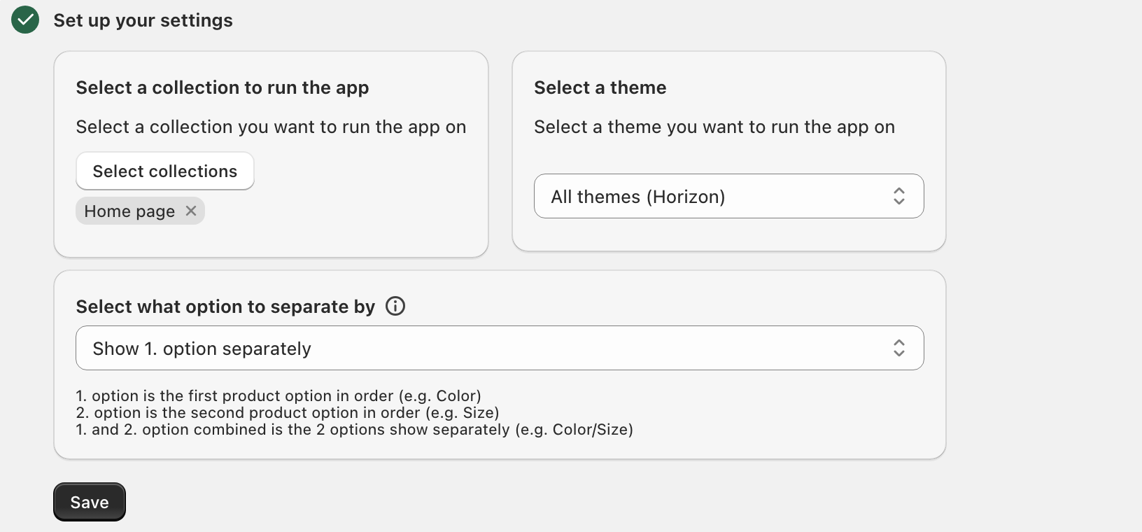

The setup guide walks through it: enable the Show variants separately setting, select a collection, select a theme, choose the option to split variants by (You can specify option to show separately).
After activate the app on your theme, click to the I have done this button, then preview collection and see the result!
Step 5 — Activate the app on your theme
Go to Shopify admin → Online Store → Themes → Customize → App embeds, enable Variants on Collection, then press Save in the top right of the theme editor. Back in the app, click I have done this.
The dashboard shows an App embed: Installed / Not installed badge, so you can confirm it took rather than guess.
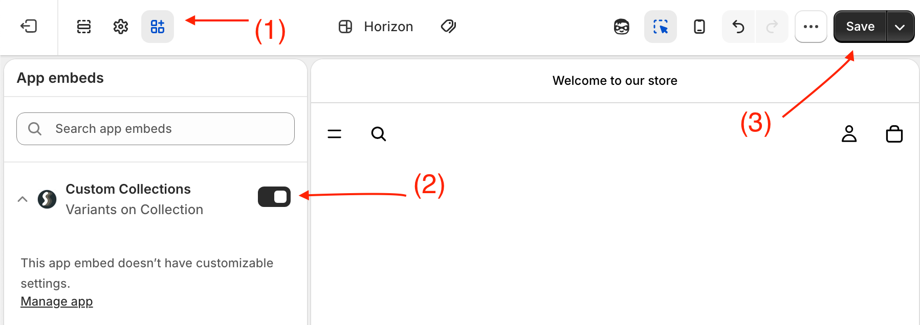
Theme editor → App embeds (1) → turn on Variants on Collection (2) → Save (3). This is the only change made to your theme.
Step 6 — Preview your collection page
Open the collection. One card per variant, each with its own image and price. Total elapsed time: about five minutes.
Making the split grid look deliberate
Splitting is the easy part. These four settings are what separate a grid that looks designed from one that looks broken.
Title format
Six cards all reading “Field Jacket” looks like a bug. Pick a format that names the variant:
- Product title – Variant title → “Field Jacket – Olive”
- Product title (option1) → “Field Jacket (Olive)”
- Variant title → “Olive”
- Product title (option1/option2/option3) → full spec in brackets
- Custom title format →
{product.title} - {variant.title}, or{variant.title} - {variant.options2}for “Olive – 45,46,47”
Price format
Where a split card still covers several variants at different prices:
- From min. price → “From $48”
- Min. price – Max price → “$48 – $56”
- Regular price → “$56”
- Custom price format, with a with/without-currency toggle
Hide rules
Splitting exposes every dead SKU and every missing photo you have. Three switches clean it up:
- Hide products/variants without images — the biggest single quality win. Turn this on before you show anyone the result.
- Hide out of stock — hides regardless of the continue-selling setting
- Hide unavailable — respects continue-selling being off
You can also exclude specific products from splitting entirely with a tag — useful for bundles, gift cards and single-variant products that should stay as one card.
Mix variants
By default, split variants of the same product sit next to each other, so one colour-heavy product can occupy a whole row. Mix variants distributes them across the grid instead. It works with the Featured and Best selling sort options.
Variant swatches on collection cards
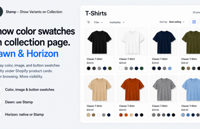
Swatches are the other half of the job — the colour dots, image chips or labelled buttons under each card. Shape (square, rounded, circle), size, height, border width and colour, alignment and margins are all configurable.
The swatch type decides what renders — a colour code, an image, or a text button. The swatch source decides where the value comes from:
- Variant — from the variant itself
- Theme swatch — the swatch colours and images you already defined on product option values in Shopify admin, falling back to Variant when a value has none
- Metafield — a variant metafield you map yourself
Sold-out values render with a double cross, a single cross or a disabled look, and you choose which surfaces the swatch applies to: collection page, search page, hand-picked, best-seller or related-products sections.
A common apparel setup: split by Color so each colourway is a card, then run a Button swatch on Size so each colour card shows which sizes are left. The shopper sees the colour, the price for that colour and the available sizes without a single click.
Sorting variants by what actually sells
Once variants are cards, product-level “best selling” is the wrong signal — the Olive jacket outselling the Bone one should show in the order. Smart sort ranks variants by their own sales performance, with optional push out of stock down and push new items to top. Run it manually or schedule a recalculation every 1 to 4 weeks.
Beyond the collection page
The same split can be applied to every other product grid in your store:
- Homepage featured collection — with a display limit and a position picker
- Search results page — the results page, not the predictive-search dropdown
- collections/all — your catch-all catalogue page
- Hand-picked, best-seller and related-product sections — as theme blocks you drop into any template
Per-collection rules
General settings apply everywhere by default; Advanced settings overrides them per collection. Inside a collection you can filter the variant list by option 1/2/3, price, inventory, discount, product tag or up to five metafields, with conditions like is equal to, contains, is empty and greater than. Set whether variants must match all or any condition, then sort by title, price, or drag them into a manual order.
So Sale can show only discounted variants split by colour with out-of-stock hidden, while your editorial collections stay untouched.
How to show variants on collection page, theme by theme
The setup above is the same everywhere. What changes per theme is which split reads best in that grid, and which of the theme’s own features to pair it with. Jump to yours:
Free Shopify 2.0 themes: Dawn · Refresh · Craft · Sense · Studio · Taste · Origin · Colorblock · Publisher · Ride · Spotlight · Crave · Trade · Rise
Horizon collection: Horizon · Atelier · Dwell · Fabric · Heritage · Pitch · Ritual · Savor · Tinker · Vessel
Vintage Shopify 1.0 themes: Debut · Brooklyn · Narrative · Supply · Venture · Boundless · Minimal · Simple · Express · Jumpstart · Pop
Popular paid themes: Impulse · Enterprise · Wonder · Pebble · Hyper · Be Yours · Focal · Prestige · Concept · Symmetry
How to show variants on collection page in Dawn theme
Dawn is Shopify’s reference theme and the default on new stores, so more collection pages run on it than on anything else. Its grid comes from sections/main-collection-product-grid.liquid, which loops products and renders each through snippets/card-product.liquid — a product loop, so variants never surface. Enable the Variants on Collection app embed, split on the 1st option (usually Color), and set Title format to Product title – Variant title. Two Dawn-specific tweaks: switch the product card image ratio from Adapt to Square or Portrait so rows stay aligned, and turn off Show second image on hover — on a split grid it can reveal a different colourway and undo the point of the split.
How to show variants on collection page in Refresh theme
Refresh sits in the Dawn family, so the collection grid is the same product loop and the same six-step setup applies. Split on the 1st option if colour or flavour leads your range. If your option naming has drifted — some products using Flavour, others Flavor or Taste — skip the positional setting and use Show selected options separately, typing every spelling in. Pair it with Hide products/variants without images; Refresh’s cards are image-forward and a placeholder tile is very visible.
How to show variants on collection page in Craft theme
Craft is a Dawn-family theme, so nothing about the setup changes. Craft catalogues tend to be built up product by product over time, which means option order is rarely consistent — use Show selected options separately and list the option names explicitly rather than relying on “1st option”. If your pieces are one-of-a-kind with few variants, Show all options combined is safe here; the card count stays manageable and every finish gets its own tile.
How to show variants on collection page in Sense theme
Sense follows the Dawn structure, so the app embed is the whole install. Where shade or scent is the first option, split on the 1st option so every shade earns a card — this is exactly the case where a single product card hides most of the range. Set Swatch source to Theme swatch so the split cards reuse the shade colours you already defined on option values in Shopify admin, and use Image swatches for anything with a texture a flat colour would misrepresent.
How to show variants on collection page in Studio theme
Studio is a Dawn-family theme with a gallery-weighted grid, so cards are large and a deep split gets long quickly. Keep it to one axis: split on the 1st option, or use Show selected options separately if you sell the same piece in several formats or sizes. Set Price format to From min. price where a split card still spans sizes, so the card does not quote a price the shopper cannot get.
How to show variants on collection page in Taste theme
Taste is in the Dawn family, so the setup is identical to Dawn’s. Where your options are weights or pack sizes — 250g / 500g / 1kg — split on the 2nd option so each size becomes its own card with its own price, and set Price format to Min. price – Max price on anything still spanning a range. Add Hide out of stock so sold-out sizes stop taking grid slots from the ones you can actually ship.
How to show variants on collection page in Origin theme
Origin is a Dawn-family theme, so the app embed is the only change made. Start with the 1st option split and Title format: Product title – Variant title. If one or two products in the collection have far more variants than the rest and dominate a row, turn on Mix variants to distribute them across the grid — it works with the Featured and Best selling sort options.
How to show variants on collection page in Colorblock theme
Colorblock is a Dawn-family theme built around bold colour, which makes it the clearest case in the whole list: if colour is the theme’s premise and your grid still shows one card per product, the theme is doing half its job. Split on the 1st option, set Swatch source to Theme swatch, and give swatches a 1px mid-grey border so white and pastel values stay visible against the card background.
How to show variants on collection page in Publisher theme
Publisher is a Dawn-family theme with content-heavy layouts, so restraint pays. Use Show selected options separately and name a single option rather than combining two — a deep split competes with the editorial content on the page. Turn on Hide products/variants without images so every card that survives the split carries its own photograph.
How to show variants on collection page in Ride theme
Ride is a Dawn-family theme, same setup, same app embed. Where both colour and size matter to the buying decision — equipment and gear usually qualify — Show 1st and 2nd option combined gives one card per colour/size pair. That produces a lot of cards, so pair it with Hide out of stock and consider Smart sort so the combinations that actually sell come first.
How to show variants on collection page in Spotlight theme
Spotlight is in the Dawn family and its grid leans on imagery, so the split has to be backed by variant photography. Split on the 1st option, then turn on Hide products/variants without images before you look at the result — on an image-led grid, one placeholder tile undermines the whole row. Set Title format to Product title (option1) if you want the variant named without lengthening the card.
How to show variants on collection page in Crave theme
Crave is a Dawn-family theme built for fast browsing, so keep the card count controlled. Split on the 2nd option where size or pack drives the decision, and leave colour-style options to the product page. Use Price format: From min. price so the smallest pack anchors the price and the card reads as an entry point rather than a ceiling.
How to show variants on collection page in Trade theme
Trade is a Dawn-family theme aimed at large catalogues, which is where explicit option naming matters most. Use Show selected options separately and list every option name and translation you use — on a wide catalogue, positional settings will always miss a segment. Then use Advanced settings to give different collections different rules rather than forcing one split across thousands of SKUs.
How to show variants on collection page in Rise theme
Rise is a free Dawn-family theme, so the collection grid is the same product loop and the same app embed handles it. Start with the 1st option split, Title format: Product title – Variant title, and Hide products/variants without images. If the resulting grid feels too long on mobile, step back to Show selected options separately with a single named option instead of a combined split.
How to show variants on collection page in Horizon theme
Horizon is Shopify’s newest free flagship, built on nested theme blocks rather than sections and snippets. Its results list handles the grid, filter state and pagination together, and it prefetches neighbouring pages to feed infinite scroll — which is exactly why forking it to loop variants is a bad idea. The app embed sidesteps all of it. Split on the 1st option, set Swatch source to Theme swatch so split cards reuse the swatch values you defined in admin, and run either Horizon’s infinite scroll or the app’s Infinite scroll — not both. Horizon’s quick view then opens on the colour the shopper clicked rather than the default one.
How to show variants on collection page in Atelier theme
Atelier is part of the Horizon collection — premium-feeling, full-width imagery, editorial layouts. Large cards mean a deep split gets long fast, so keep to Show 1st option separately and resist combined splits. Set Title format to Product title – Variant title so the extra cards read as intentional, and turn on Hide products/variants without images — at Atelier’s card size, a placeholder is impossible to miss.
How to show variants on collection page in Dwell theme
Dwell is a Horizon-collection theme with soft tones and a homeware feel, so finish and material are usually the axis that matters rather than a loud colourway. Use Show selected options separately and name the option — Finish, Material, Colour — rather than relying on option position. Pair with Image swatches so textures like oak, walnut and linen render as themselves instead of as approximate colour dots.
How to show variants on collection page in Fabric theme
Fabric is a Horizon-collection theme built around large image grids and diverse catalogues, which means it absorbs a dense split better than most. Split on the 1st option, and if your catalogue genuinely spans several option structures, use Advanced settings to give each collection its own rule rather than one global split. Smart sort is worth enabling here so the variants that sell rise to the top of a wide grid.
How to show variants on collection page in Heritage theme
Heritage is a Horizon-collection theme aimed at classic, story-led brands, where a chaotic grid works against the positioning. Keep the split to a single axis — Show 1st option separately — and use Title format: Product title (option1) so cards stay compact. Turn on Hide unavailable so discontinued colourways drop out of the grid quietly instead of showing as dead ends.
How to show variants on collection page in Pitch theme
Pitch is a Horizon-collection theme built for creative and content-driven shops, where the grid usually sits alongside editorial content. Split narrowly: Show selected options separately with one named option. Use the app’s Display limit when you extend the split to a homepage featured collection, so a section designed for eight products does not suddenly render forty.
How to show variants on collection page in Ritual theme
Ritual is a Horizon-collection theme with luxury fashion-magazine styling and large, image-driven cards. Split on the 1st option only — a combined split multiplies an already tall grid. Set Price format to From min. price rather than a range if a single figure reads cleaner against the layout, and use Hide products/variants without images so every card carries the photography the theme is built to show.
How to show variants on collection page in Savor theme
Savor is a Horizon-collection theme with clean, product-forward layouts. Where size or pack drives price, split on the 2nd option so each size gets its own card and its own figure, and set Price format to Min. price – Max price for anything still spanning a range. Add Hide out of stock so the grid only shows what you can ship today.
How to show variants on collection page in Tinker theme
Tinker is a Horizon-collection theme built for tools, tech and home goods — practical catalogues where the meaningful option is capacity, length or material rather than colour. Use Show selected options separately and name those options explicitly. Button swatches suit this better than colour dots, since the values have names rather than looks.
How to show variants on collection page in Vessel theme
Vessel is a Horizon-collection theme with a clean, detail-forward card. Split on the 1st option and set Swatch source to Theme swatch so the split cards inherit the swatch colours and images already defined on your option values, falling back to the variant where a value has none. Choose the Disabled look sold-out style — on a minimal card it reads better than a cross.
How to show variants on collection page in Debut theme
Debut was Shopify’s default before Dawn, and plenty of stores still run it. It is a vintage 1.0 theme, so app blocks are unavailable — but per Shopify’s documentation, “App embed blocks are supported in vintage and in Online Store 2.0 themes, because they don’t rely on sections or JSON templates.” Variant splitting runs through the app embed, so it works. Debut catalogues are usually old enough that option naming has drifted, so use Show selected options separately and include historic spellings and translations.
How to show variants on collection page in Brooklyn theme
Brooklyn is a vintage 1.0 theme built around brand imagery, which makes hidden colourways especially costly — the image is the product information. The app embed is supported on vintage themes, so the setup is unchanged. Split on the 1st option and turn on Hide products/variants without images first; older catalogues have the worst variant-image coverage and the split exposes every gap at once.
How to show variants on collection page in Narrative theme
Narrative is a vintage 1.0 theme designed for small, story-led catalogues. With few products and few variants, Show all options combined is safe here — the card count stays low and every variant earns a tile. Because Narrative predates Shopify’s native swatch values, set Swatch source to Variant or map a variant metafield rather than expecting Theme swatch to find anything.
How to show variants on collection page in Supply theme
Supply is a vintage 1.0 theme built for large inventories with filtering, which is exactly where splitting pays off: filtering to a colour on an unsplit grid returns products that mostly show something else. Use Show selected options separately given the catalogue size, and pair it with Hide out of stock so filters do not lead shoppers to dead ends.
How to show variants on collection page in Venture theme
Venture is a vintage 1.0 theme aimed at large catalogues. Where both colour and size drive the decision, Show 1st and 2nd option combined gives a card per pair — but on a catalogue this size, check the result on mobile before publishing. Use Advanced settings to apply the aggressive split only to the collections that benefit, and leave the rest on a lighter rule.
How to show variants on collection page in Boundless theme
Boundless is a vintage 1.0 theme built on full-screen imagery and minimal text, so cards are very large and a deep split becomes an extremely long page. Restrict it to Show 1st option separately, and consider Title format: Variant title so the card text stays as sparse as the theme intends. Hide products/variants without images is effectively mandatory here.
How to show variants on collection page in Minimal theme
Minimal is a vintage 1.0 theme with a clean, product-forward grid across its three styles. Split on the 1st option and keep the swatch styling restrained — a circle shape at a small size with a thin border matches the theme better than large chips. Since Minimal predates native swatch values, drive swatches from Variant or from a mapped metafield.
How to show variants on collection page in Simple theme
Simple is a vintage 1.0 theme with sidebar navigation and deep catalogues. Use Show selected options separately and name your options rather than relying on position — on a catalogue built over years, positional assumptions break. Turn on Hide unavailable so retired variants stop occupying grid slots, and use the per-collection overrides so each category can have its own rule.
How to show variants on collection page in Express theme
Express is a vintage 1.0 theme built for fast, low-friction browsing. Split on the 2nd option where size or pack drives the choice, so the shopper picks a concrete item straight from the grid. Enable the add to cart button on a paid plan so a split card can be bought without a product-page detour — which is the whole premise of the theme.
How to show variants on collection page in Jumpstart theme
Jumpstart is a vintage 1.0 theme for very small catalogues. With a handful of products, Show all options combined turns the whole range into a browsable grid without producing an unmanageable card count. Set Title format to Product title – Variant title so each tile is unambiguous, and leave the hide rules on to keep the short grid clean.
How to show variants on collection page in Pop theme
Pop is a vintage 1.0 theme with bold styling and small catalogues. Split on the 1st option so each colourway gets its own tile, and give swatches a visible border — bold card backgrounds swallow light swatch values otherwise. As with every vintage theme, the app embed is supported; only the drag-in section blocks are Online Store 2.0 only.
How to show variants on collection page in Impulse theme
Impulse is one of the most-installed paid themes on the Shopify Theme Store, listed at $500 with a 94% merchant rating. It renders swatches on collection cards already — but a swatch is not a card: it does not get its own grid slot, its own price or its own place in the sort order, and it does not appear when a shopper filters to that colour. Split on the 1st option, then check the hover image swap; on a split grid the theme’s second image can belong to a different colourway. Because the app runs as an app embed, Impulse keeps receiving updates normally.
How to show variants on collection page in Enterprise theme
Enterprise is listed at $420 with a 94% rating and is built for wide catalogues, which makes explicit option naming the right call: use Show selected options separately and list every option name and translation. Use Advanced settings to vary the rule per collection rather than forcing one split across the whole catalogue, and enable Smart sort so the best-performing variants lead a large grid.
How to show variants on collection page in Wonder theme
Wonder is listed at $390 with a 99% rating. The setup is the standard app embed — no theme fork, so the theme’s update stream is unaffected. Split on the 1st option, set Swatch source to Theme swatch so split cards reuse the swatch data you already maintain in admin, and decide whether to keep the theme’s own card swatches or the app’s; running both is worse than running either.
How to show variants on collection page in Pebble theme
Pebble is listed at $400 with a 98% rating. Split on the 1st option and set Title format to Product title – Variant title so the extra cards read as deliberate. If the theme runs its own load-more or infinite scroll, pick one: either the theme’s or the app’s Infinite scroll / Auto load more, never both.
How to show variants on collection page in Hyper theme
Hyper is listed at $400 with a 99% rating. Where both axes drive the decision, Show 1st and 2nd option combined produces a card per pair — the most granular useful split. Pair it with Hide out of stock and Smart sort, because a combined split without ranking leaves the grid ordered by nothing in particular.
How to show variants on collection page in Be Yours theme
Be Yours is listed at $350 with a 98% rating. Split on the 1st option and match the app’s swatch styling to the theme’s existing card design — shape, size, border width and colour, alignment and margins are all configurable, so the swatches can be made to look native rather than bolted on. Set the sold-out style to Disabled look if the theme’s card design is on the minimal side.
How to show variants on collection page in Focal theme
Focal is listed at $320 with a 93% rating. Standard app-embed setup, 1st option split, Product title – Variant title. The setting worth attention here is the theme’s hover image: if the second image belongs to another colourway, either disable the swap or reorder your variant images so the hover shot matches the card. Extend the split to the search page on a paid plan so filtered and searched grids behave consistently.
How to show variants on collection page in Prestige theme
Prestige is listed at $400 with a 91% rating and leans editorial, with large cards and generous spacing. Keep the split shallow — Show 1st option separately only — so the grid does not run away. Set Price format to From min. price for a cleaner single figure, and use Hide products/variants without images so every card carries the photography the theme is designed around. Because nothing in the theme is edited, Prestige updates install normally.
How to show variants on collection page in Concept theme
Concept is listed at $400 with a 98% rating. Use Show selected options separately and name your options if the catalogue mixes structures, otherwise the 1st option split is the faster route. Turn on the app’s add to cart button on a paid plan and set its text and background colour to match the theme’s existing button, so split cards keep the design you paid for.
How to show variants on collection page in Symmetry theme
Symmetry is listed at $420 with a 94% rating and is commonly used for deep catalogues with sidebar filtering — the scenario where splitting has the largest effect, because filtered results finally match the filter. Use Show selected options separately for reliability across a wide catalogue, add Hide out of stock so filters never lead to dead ends, and set per-collection rules in Advanced settings.
Other popular paid themes
The same setup applies without modification to Broadcast, Motion, Eurus, Release, Stiletto, Xtra, Palo Alto, Sleek, Allure, Ignite and Monk, and to any other Shopify theme. Enable the app embed, choose your split, set the title and price formats, and preview.
Why one setup works on every theme
Two things make it theme-agnostic.
First, it installs as a Shopify app embed, not a theme edit. Shopify’s documentation is explicit that app embed blocks work on vintage and Online Store 2.0 themes alike, because they do not depend on sections or JSON templates. That is why Debut and Horizon take the same install.
Second, variant cards are not generic. The app works from a per-theme template — a mapping of your theme’s collection container, product card element, title, image (including the hover or secondary image), price, sale price and badge markup — so variant cards are cloned from your theme’s card and rewritten per variant. Your card design, badge styling and button treatment carry over instead of being replaced.
Troubleshooting
Nothing changed on the collection page
Check the App embed badge on the dashboard. If it reads Not installed, the theme editor save did not register — reopen Customize → App embeds, enable Variants on Collection, and press Save.
Only some products split
Option names are inconsistent across the catalogue. Switch to Show selected options separately and type in every spelling and translation you use.
The grid is full of placeholder images
Turn on Hide products/variants without images, or assign images to variants in Shopify admin.
Too many cards
You are probably on Show all options combined. Step back to a single option, or use Show selected options separately and name just the axis your shoppers browse by.
I changed my theme
Enable the app embed on the new theme and press Enable App in Theme settings. Your settings carry over. Theme updates need no action at all.
I need it off right now
The Emergency switch on the dashboard turns the app off on your storefront instantly and keeps every setting. Use that rather than uninstalling.
FAQ
Does showing variants on the collection page duplicate my products?
No. Your catalogue, variants, inventory and product pages are unchanged. Only what the grid renders changes, which is why it is reversible in one click.
Does it work on my theme?
Yes. It installs as a Shopify app embed, which is supported on both vintage 1.0 and Online Store 2.0 themes — Dawn, Horizon, Debut, Impulse, Prestige and everything else.
Do I need to edit theme code?
No. The only change is toggling an app embed on in the theme editor. No Liquid file is modified.
Will it break when my theme updates?
No. Because no theme file is edited, theme updates install normally and need no action.
Can I show variants as products on the search page and homepage too?
Yes. The search results page, homepage featured collections and collections/all are separate switches on the paid plans, plus hand-picked, best-seller and related-product blocks.
Can different collections have different rules?
Yes. Advanced settings overrides the defaults per collection, including variant-level filters by option, price, inventory, discount, tag or metafield, and manual sort order.
How long does setup take?
About five minutes: enable the app embed, turn on Show variants separately, pick a collection, pick the option to split by, set the title format, preview.
Get started
The Build plan is free with full feature access, so you can split a real collection on your own theme and judge the result before paying anything. Standard and Advanced unlock all collections, the add-to-cart button, homepage featured collections, the search page, collections/all and infinite scroll, both with a 3-day free trial.
Install Stamp — Show Variants on Collection and show variants on your collection pages in about five minutes.